Hello!
Overview
Well it's been a tricky road however we have got to stage of creating our magazine front cover. I was really looking forward to these because creativity is a strong point for me and I did well when I made a magazine front cover, contents and double page spread last year. On the whole though it took quicker then last time, this being down to the fact that I knew more about Photoshop CS3 and so this helped immensely.
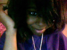
We took a variety of photos of Ella so that we were sure to get a photo that would catch the audience's eye if they were to walk past the magazine. The look we were going for is quite an innocent look however if it was possible we would direct Ella to sometimes look guilty (in some photos) as sometimes it came out as if she was happy when it is suppose to be a horror magazine front cover.
However the photo we chose for our final one is the one below as we believed that the look she gave was amazing. What I mean by this is that to some audiences she looks scared, to some she looks innocent and to other she looks innocent (this evidence will be part of the feedback post).
We then decided to pick between either Empire or Total Film in which these are both British film magazines. As a group we decided on Total Film as they are not a genre specific magazine and their magazines gets read by a variety of audiences and this would be good for getting our trailer/film known among a range of audiences (above 18).
Then, we decided to look on the Internet for inspiration so that we could do Total Film justice. Here are a view examples that we looked at:


This type of shot (medium long shot) is quite typical for magazines and we wanted something different so we decided to keep on searching. During our search we stumbled across this:

We decided to go for this one for inspiration because it gets its message across quickly and it caught my eye when I was searching it must have got the audience's eyes too if it caught mine. Our photo is similar to this also so this would help when we are structuring our magazine. Additionally, I found that having the magazine black and white was an interesting look so I kept this in mind. Moreover, the colour scheme is similar to ours too so this would guide us into choosing the best colours to have the magazine.

This was the first process of the magazine in which we cut the actress out from the background and placed her on a black background. We thought that this would make her stand out more and once again go along with our colour scheme. As you can see, her eyes are our a mixture of colours and so the black background really makes her eyes stand out too.

We then decide to put some text onto it so that we got the feel of what the final magazine to look like and because we wanted to make process. We put in the Total Film header and some films at the bottom so the audience could see what films were coming out at that specific time.
NOTE: Since our film is supposedly coming out on the 12/12/12 we gathered films from reliable sources that told us films coming out around this date and also around November as it is a November issue. We also stayed true to Total Film by having the issue number the exact one it would be if the magazine was to release in November 2012 (This was worked out from using a previous Total Film magazine)


Due to this our issue is our issue is 172:

Although we were happy with the product, and we did get some praise for it, it did suffer many criticisms.
Praise:
- The photo that was chosen - The audience were happy with the photo we chose as it made the the actress stand out from the magazine and it was a unique type of shot (head and shoulders shot) to use for a magazine.
- The cover lines
- The size of the cover lines font
- The editing for the photo (around the hair) has been poorly done
- The black background is quite cheap and boring
- It would have been better if she was looking at the camera
- The font should be different from the cover lines to information about the coverlines underneath
- The text underneath the Damnation is lost
- The colour choice
- Teasers at the bottom

0 comments:
Post a Comment